Purpose
Help businesses show up in the everyday places where people live, work, shop, and spend time.
10-page A4 guide · Choose “Save as PDF” in the print dialog · Enable background graphics and turn off headers and footers.
 Brand standards / 2026
Your brand.
Out in the real world.
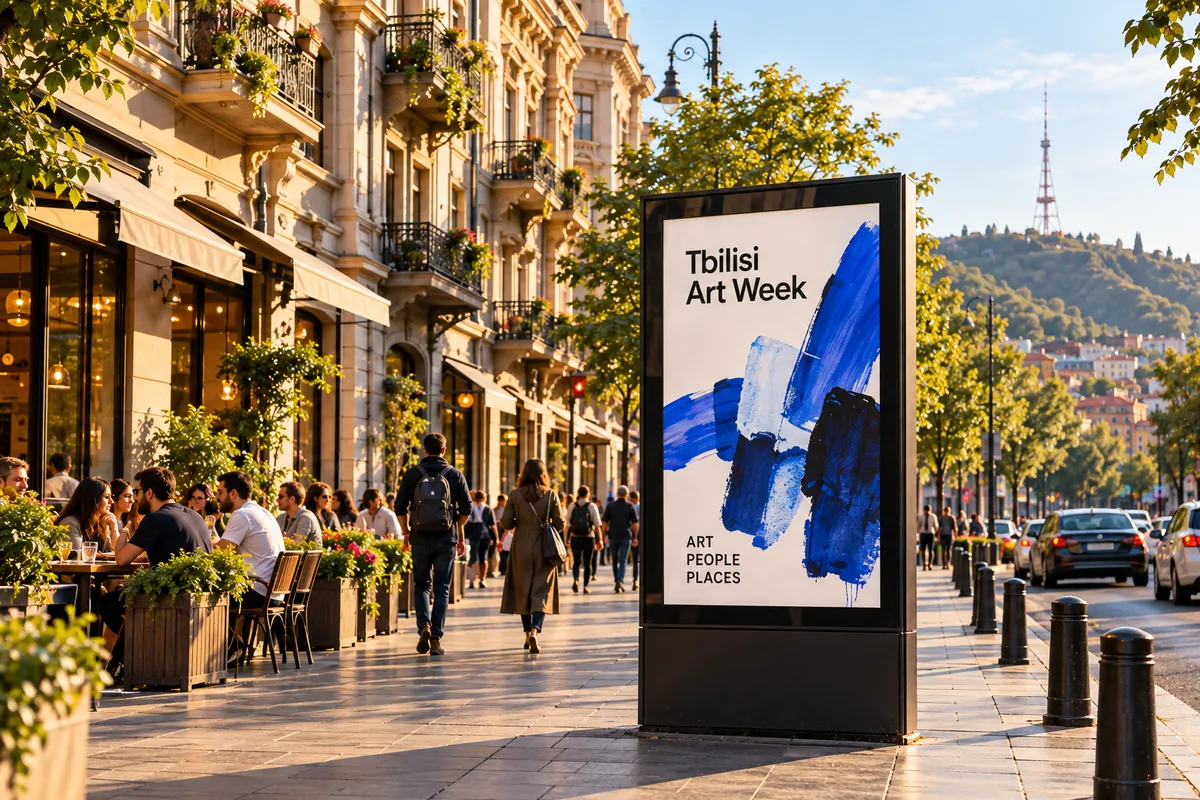
Built from the current SwiftAd website. Existing assets and messaging are distinguished from proposed brand standards. Cover image: illustrative placement.
01 / Brand foundation
SwiftAd connects digital creativity with physical places. The brand makes real-world screen advertising feel clear, approachable, and thoughtfully designed.
Your brand. Out in the real world.
Help businesses show up in the everyday places where people live, work, shop, and spend time.
Make planning and managing real-world screen advertising simpler, from preparing a creative to choosing screens and scheduling a campaign.
A city where businesses of every size can connect with relevant audiences through well-placed, well-designed screen advertising.
Clarity over complexity. Real places over abstract reach. Useful creativity over novelty. Honest expectations over inflated promises.
The headline is current website copy. Mission, vision, and principles are recommended brand direction, not a statement of verified business operations.
02 / Positioning & audiences
Working positioning: for businesses that want visibility beyond online feeds, SwiftAd brings creative preparation, screen discovery, and campaign planning into one connected experience.
Cafés, shops, fitness studios, hospitality, and service businesses. Lead with a relatable setting and a clear next step, not advertising jargon.
Teams coordinating creative and campaign schedules. Emphasize a shared workspace, clear campaign status, dates, and screen choices.
Property managers and operators of offices, lobbies, retail, and hospitality spaces. Discuss installation, custom enclosures, and compatible displays without promising earnings.
Prepare: upload video or explore paid AI creation. Plan: choose screens, dates, and airtime. Manage: follow campaign status. Connect: explore kiosks and compatible existing monitors.
Audience groups are recommendations inferred from the website. Geography, inventory, pricing, and feature availability must be confirmed before sales use.
03 / Logo system
Use the existing SwiftAd logo artwork as the master. Write the name as SwiftAd in text: capital S, capital A, no space.
Keep an exclusion zone of at least half the full logo height on all sides. No copy, borders, or imagery should intrude into this area.
Recommended minimum width: 120 px on screen or 32 mm in print. Keep its original proportions and use a clean white surface; on photography or dark backgrounds, place it on a white panel.
Do not stretch, rotate, recolor, outline, add shadows, rebuild with a font, or crop parts of the logo. Do not invent a separate symbol or reversed version.
Spacing and minimum sizes are new working guidelines. Check legibility at final output size; commission approved monochrome and reversed masters if needed.
04 / Color palette
The primary blue anchors actions and recognition. White and dark neutral text carry the layout; pale blue and restrained accents add warmth without competing with the message.
Recommended balance: about 70% white or light neutral, 20% dark text and structure, 10% blue and supporting accents. This is a visual guide, not a rigid formula.
Use white labels on primary blue and dark text on pale surfaces. Mint and peach are accents, not small-text colors. Never communicate status by color alone; include a label or icon.
HEX and RGB define the digital palette. Convert through the printer’s paper-specific ICC profile and request a physical proof. No Pantone or CMYK match is approved in this guide.
The website contains section-specific neutrals. This guide consolidates them into a recommended core palette using colors already present on the site.
05 / Typography
DM Sans is the website’s principal Latin typeface. Noto Sans Georgian supports Georgian content. Preserve the same calm hierarchy in both languages.
თქვენი ბრენდი. რეალურ სამყაროში.
NOTO SANS GEORGIAN / GEORGIANDigital: display 48–72 px, section title 32–48 px, body 16–18 px, caption 12–14 px. Print: display 32–44 pt, section title 22–28 pt, body 10.5–12 pt, caption at least 9 pt.
Use 500–600 for headings, 400–450 for paragraphs, and 600 for short labels. Give body copy 1.5–1.65 line height. Tighten Latin display tracking slightly; avoid tight tracking in Georgian.
Keep SwiftAd in Latin lettering. Use natural Georgian phrasing, not transliteration. Allow extra room for translations and have a fluent reviewer approve production copy. Use Arial or a system sans-serif only as a fallback.
The families come from the existing website; the consolidated scale is recommended. Ensure fonts finish loading before exporting and check embedding in production PDFs.
06 / Voice & messaging
SwiftAd sounds confident, helpful, and grounded. Use short active sentences, familiar words, and specific next steps. Technology supports the story; it is not the story.
Create an ad. Choose your screens. Show up where life happens.
Your brand. Out in the real world. Supporting message: Your video, your screens, one workspace. Partner message: Have a space? Make it a screen.
Use “Choose your screen, dates, and airtime.” Avoid “Leverage our omnichannel activation ecosystem.” Use “Submit for review.” Avoid “Go live instantly everywhere.”
Use descriptive verbs: Plan your campaign. Explore locations. Upload a video. Explore screen options. Match the label to the destination and the feature actually available.
Identify paid AI generation. Label illustrative placements and product previews. Describe rollout-dependent features as planned. Never turn forecasts into measured views or imply confirmed venues, guaranteed reach, or instant approval.
Core and supporting messages are drawn from the website. Availability and delivery depend on the actual service, review, payment, and screen inventory.
07 / Photography & art direction
Use cinematic, believable everyday environments: elevator lobbies, streets, cafés, shops, restaurants, and fitness spaces. A screen should feel installed in a real place, not pasted onto a background.

Show enough architecture to establish context. Keep screen perspective, reflections, and lighting believable. Favor clean framing, natural daylight, and an uncluttered focal point.
Make the advertised message legible at a glance: one headline, a clear subject, and a simple next step. Respect the actual portrait or landscape format and safe areas.
Mark generated or sample scenes as illustrative. Do not treat them as proof of a live venue or client campaign. Confirm image, model, artwork, and trademark permissions before public commercial use.
These are existing illustrative website assets, not a verified inventory or record of delivered campaigns.
08 / Layout & applications
Generous spacing, large straightforward headlines, pill-shaped actions, subtle borders, and rounded panels create a consistent visual language across the website and brand materials.
Create an ad. Choose your screens. Show up where life happens.
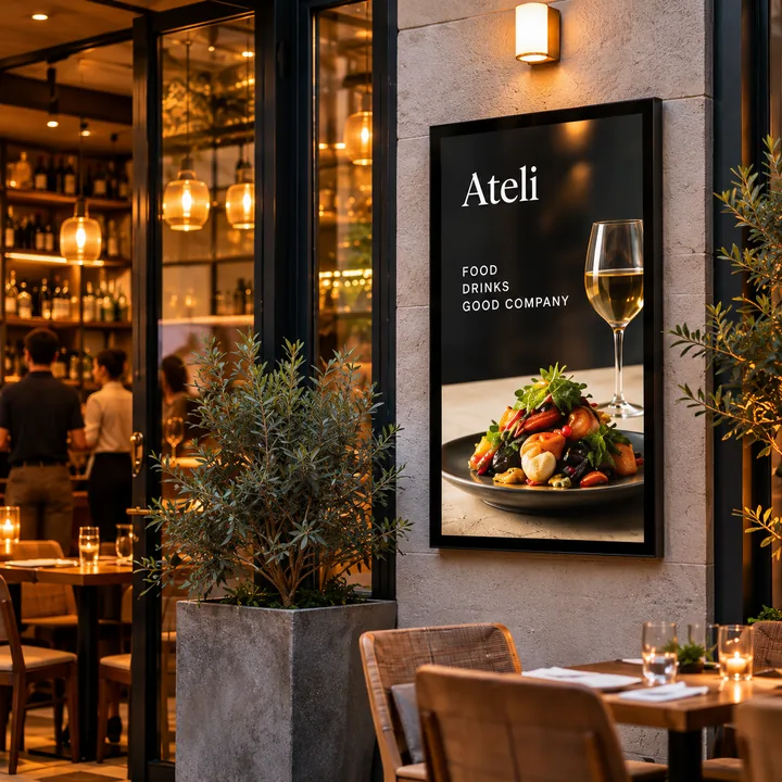
Start with one dominant message and one clear action. Use an 8-point spacing rhythm digitally, align content to a simple grid, and keep paragraphs short. Favor space over decorative effects.
Use blue for the primary action, neutral surfaces for supporting content, and consistent line icons. Keep labels with unfamiliar icons. Provide visible focus states and respect reduced-motion preferences.
A cover carries the logo and one idea; content pages pair a headline with concise evidence. For signage, keep text large and check it at viewing distance. Do not add QR codes until their destination exists and has been checked.
The sample is a proposed visual application, not a functional advertisement or booking interface. Avoid decorative controls in production designs.
09 / Governance & handoff
Use this guide as a working reference for designers, writers, partners, and production teams. Preserve the existing identity while treating new standards as recommendations pending owner approval.
Check the exact SwiftAd name and master logo. Use the core palette and type hierarchy. Confirm legibility, contrast, destination links, image rights, translations, and all availability or performance claims.
Use A4 portrait, 100% scale, and disable browser headers and footers. Enable background graphics for full-color output. Review every page in the saved PDF. For commercial printing, arrange bleed, color conversion, and a printer’s proof separately.
Keep the original SVG logo, licensed font sources, approved imagery and rights records, bilingual copy, and final export files together. Maintain a dated changelog when standards change.
Approve the proposed mission, vision, audience positioning, logo clear space and minimum size, consolidated palette, and type scale. Confirm legal company details and commercial claims before external distribution.
SwiftAd Brand Guide · Working edition 1.0 · October 2026. Based on the current website; not a trademark clearance, legal policy, or certification of product availability.